Perfecting The Art Of Data Visualization

Data visualization: what is it?
Advancements in technology have made data more accessible than ever. However, data isn’t useful in itself. We must be able to interact with data and make sense of it by identifying and understanding patterns and outliers. We need to be able to present data in the best way possible.
Data Visualization is the graphic representation of data. The key is understanding the best ways to reveal complex information at a glance. Data Visualization isn’t about knowing which graph or chart is the best to use; it’s about understanding the layers of detail that generate insights. Since art concerns itself on matters of beauty, our visualization cannot be devoid of aesthetic considerations.
Perfecting the art of data visualization
For a visual to qualify as beautiful, it must be aesthetically pleasing as well as novel, informative, and efficient. Efficient visualization should convey information clearly; excite and engage observers; drive home the intended message, and remain to the point.
Intended message
The first step of data visualization isn’t the nitty-gritty of format or structure; it is the intent. It’s essential to envisage your intent and ascertain your goal. For instance, you determine that your intent is to sell your product to a new audience. Identifying a goal will help you articulate a clear purpose of your visual. Your goal could be to devise a new strategy to gain engagement from the new audience.
The data itself
Keeping in mind the intent of the visual, the next step is to select what data is best suited to meet your goals. Not all data is relevant. Data needs to be culled to communicate a clear message. When trying to market a product to a new audience, relevant data could include demographics, what channels your target audience use, their purchase history, and loyalty.
Graphical and aesthetic construction
Graphical construction includes layouts, axes, shapes, colors, lines, and typography. The main purpose of graphical elements is to lay out information. When using graphical elements, any element that doesn’t guide, communicate or highlight information is extraneous. It will take away rather than add value to your representation. Your choice of graphical construction needs to be clear and efficient.
Aspects such as color, placement, size, icons, layout, and labels are all aesthetic considerations. These choices must take into account the familiarity of the audience and minimize noise.
Data visuals are used for the same purposes as speech: to inform, to persuade, or to entertain. Here is a quick summary of what different graphical representation tools are best suited to do:
- To compare sets of values: column charts, mekko charts, bar graphs, pie charts, scatter plots, bullets, and line graphs
- To show composition (parts that make up a whole): pie charts, stacked bar charts, mekkos, stacked columns, area charts, and waterfall charts
- To showcase distribution of data: scatter plots, mekkos, lines, columns, and bars
- To analyze trends: line charts, dual-axis lines, and column charts
- To establish relationships between data sets: scatter plots, bubbles, and line charts
Once you have the data, graphical construction and aesthetic choices go hand-in-hand. They must be worked on simultaneously to determine the best way to portray data.
Here are a few things to consider when deciding on how to design visualization for your data:
Size as differentiator
Using size to differentiate is best used to represent few data points with enormous variations because it promotes intuitive differentiation.
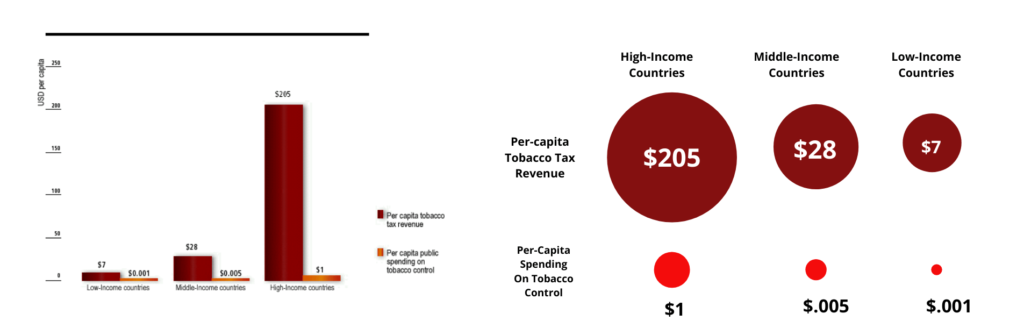
Source: WHO Report on the Global Tobacco Epidemic, 2008, page 57
As shown in the graph above, there is a vast difference between the per-capita tobacco tax revenue and the per-capita spending on tobacco control. The difference in the size of the circles, or the difference in the heights of the bars, immediately grabs attention and showcases the disparity between the two components. On the same note, here are two graphs portraying the same information on opinions around animal cruelty.
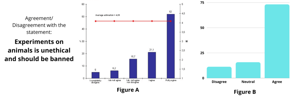
Source: Animal Friends Croatia
If a marketer for a cosmetic company wants to push for cruelty-free branding, Figure B would be more effective in showing the vast difference in opinion of the general public.
Data matrices
Data model matrices are useful for database project evaluation because they expose non-intuitive data properties that are hard to uncover by simply looking at common indicators. Models and matrices can be applied to help long-term strategic planning and solve real-world marketing challenges. Here’s an example of a matrix useful in evaluating the investment in marketing channels.
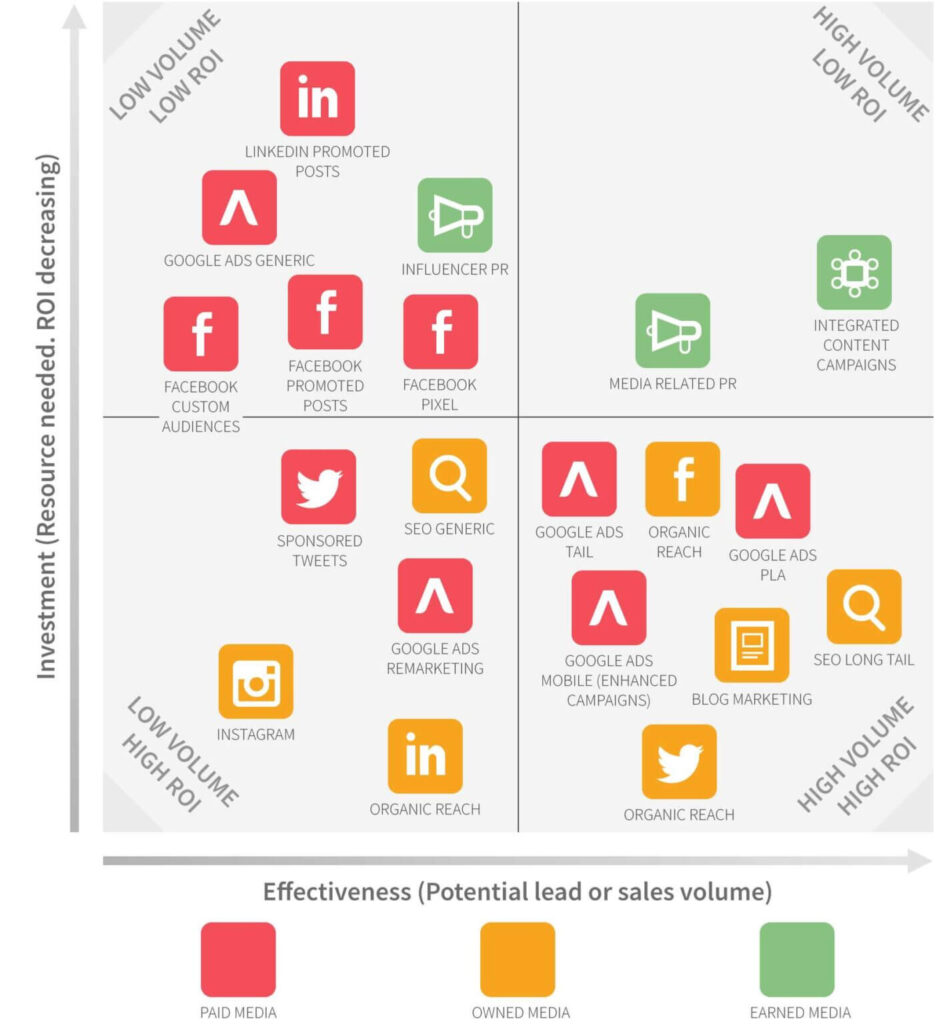
Source: Smart Insights
Based on the information collated on the matrix, a brand can better decide where to invest. For example, a brand could consider increasing investment in platforms under the ‘Low Investment, High ROI’ square, and decreasing investment in platforms under the ‘High Volume, Low ROI’ square.
Colour as diffrentiator
Using color to differentiate is best used in enormous, high-resolution sets of data. Different shades of colors are used to identify patterns in large datasets. However, color may not be an effective tool for reaching larger audiences because people may be afflicted with colorblindness.
Fonts for a visual must be legible. It shouldn’t be difficult to read the words because they look prettier in a fancier font; this is extremely counterintuitive. Let’s say you are a cigarette company looking to expand your global sales. Here’s some data that would help you decide where to increase investment based on the proportion of smokers worldwide.
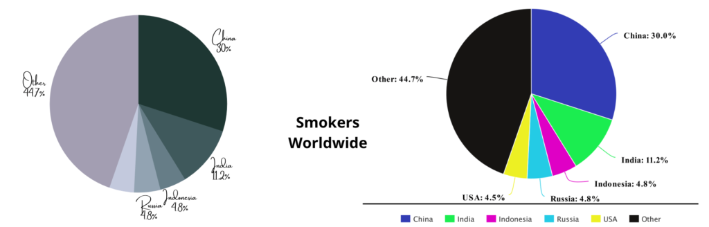
Source: WHO report on the Global Tobacco Epidemic, 2008, p19
In the first figure, it’s extremely difficult for someone with color-blindness to differentiate between the countries. The font, despite its fanciness, deemphasizes countries that need to be highlighted. Although the colors in the second chart don’t serve a special purpose, they help differentiate between the countries and show investors that China is the largest market for cigarette consumption.
Data sets factoring time
Using a visual that factors in time (where the data is shown to change over time) must be backed up by context, and sudden changes must be explained.
Location-based visuals (on maps) hook the audience if they’re familiar with the location. Furthermore, interactive visualizations that use location must be targeted towards those who are deeply familiar with the location. For instance, the graph below tracks development across Brazil through education, longevity, and income indexes.
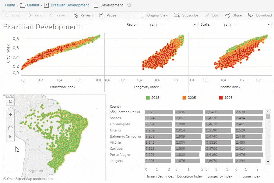
Source: https://www.tableau.com/learn/articles/data-visualization
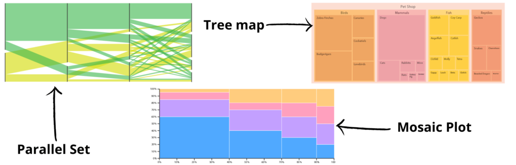
Only a person familiar with counties across Brazil would be equipped to navigate this chart. Categorical data are best visualized through three techniques: treemaps, parallel sets, and mosaic plots (also known as mekko charts).
The Gloucestershire County Council’s use of parallel sets is a great example of an efficient way to present data. The council was measuring the effectiveness of its marketing campaign by carrying out massive public surveys that asked two questions:
- Have you seen the posters?
- Do you think the Council provides great value services?
When they tried using pie charts, four of them were needed to show the same data set: one showing opinions of people who had seen the posters; one for those who had not; one to show the total exposure of the campaign; and one showing the overall opinion of services provided.
However, parallel sets allowed for plotting the data of these questions in terms of one another on a single graph!
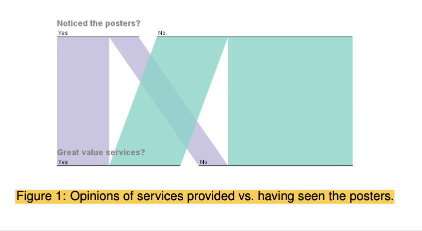
Source: Researchgate
Conclusion
The convenience and conventionality that comes with using standard formats make them the most commonly used means of information visualization. However, a truly good representation requires the creator to leverage the familiarity that stems from standard formats and tailor them to create unique representations to meet the needs of your information.